Among myriad physical disabilities people suffer from, color blindness is one of the most found issues. It is a condition in which individuals cannot perceive colors. People with color blindness issue have difficulty distinguishing between some specific hues and thus, they see colors differently than others. Mainly, there are four types of color blindness: red-green, blue-yellow, red-black, and complete.
Therefore, while designing websites under web accessibility best practices, adhering to the defined color guidelines (by WCAG) makes websites accessible for color-blind users. And the accessible online information reaches to color-blind users with the similar essence that other users experience.
Not only web accessibility best practices but some tools and techniques can also help designers create accessible websites; let’s learn more.
Certain types of companies including Government agencies, educational institutions, healthcare providers, banks, insurance companies, ecommerce platforms, technology companies, and public service organizations are more likely to require color blindness accessibility features on their websites due to the nature of their services, regulatory requirements, and the diversity of their user base.
Color blindness and its types – detailed information!
As mentioned above, color blindness is a disability to see and identify certain colors or perceive color differences. Strangely, more males across the world are suffering from this issue than females. According to the American Academy of Ophthalmology, around 0.5% women and 8% men complained color blindness in the United States.
In some cases, it is not a problem of concern, but a few people have severe issues recognizing colors.
Red-Green color blindness
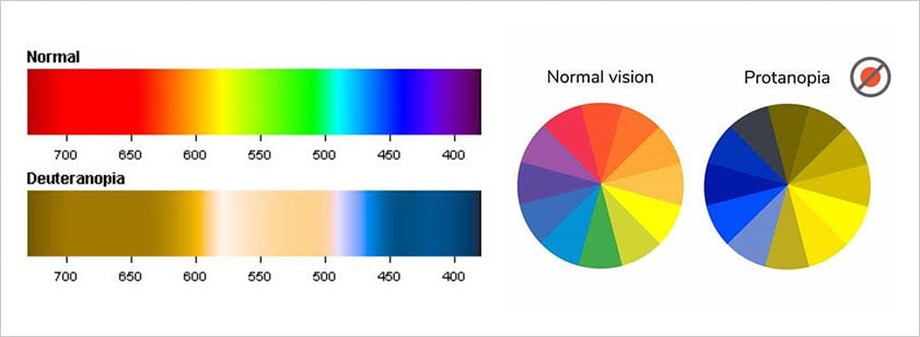
This is one of the most common color blindness conditions including two sub-types. One is Deuteranopia and the other one is Protanopia. People who cannot see red color suffer from Protanopia and those who have Deuteranopia, cannot perceive green color. Moreover, in both conditions, people face problems in distinguishing between red and green colors.
Blue-Yellow color blindness
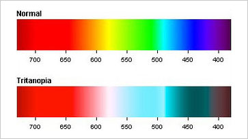
People who suffer from blue-yellow color blindness, cannot discern blue color and sometimes, they even find it difficult to differentiate between yellow and blue colors. The situation is called Tritanopia.
Red-Black color blindness
Red-Black color blindness is very less, mostly people face above two colors blindness. In this type of color blindness, if red and black colors are kept together then people will not be able to differentiate between them. Thus, web pages with a black background and red text are problematic for such users.
Complete color blindness
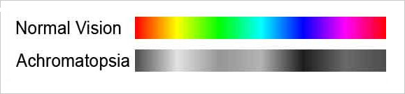
Complete color blindness is also called Achromatopsia. This situation is rare. Such people who cannot see any color but only grey in place of different colors have Achromatopsia.
Web designing practices to remove accessibility barriers for color-blind people!
According to W3C WCAG standards for color blindness:
- Color should not be the only medium to convey information or prompt responses.
- There is a defined color contrast ratio for the visual presentation of text and images of text (4.5:1).
Other practices to follow:
Patterns and textures can help in making the charts and diagrams comprehensive!
If graphs and pie charts on web pages contain colors to show different data information, some users face difficulty in understanding such data.
Using patterns and textures instead of colors makes graphs or pie charts simple to understand. Also, labeling each section can help create an understandable chart irrespective of the colors used to denote a specific section in that visual representation.
Using relevant symbols makes accessible forms or log-in fields for color-blind users!
As written above, to adhere to W3C compliance standards, depending solely on colors to communicate any sort of message or information is not allowed.
Thus, for an appropriate web design, try using symbols or text with colors to convey messages correctly.
Avoid a few color combinations!
Some color combinations trouble people with color blindness and even users who have vision issues. Thus, choosing the right color combinations for web design is a crucial aspect to bring accessibility for everyone. A few defined combinations of colors directly affect visibility and readability for users with visual impairments:
Green-red, green-blue, green-brown, green-black, green-grey, blue-grey, light green-yellow, blue purple.
Important buttons must stand out!
If a web design relies on colors to differentiate buttons, it will be problematic for users with color blindness.
Thus, instead of using only colors to display buttons, increase the size of a primary button, increase contrast between the primary and secondary buttons, and use borders and icons to let users know which one is the primary button.
Don’t forget to underline the links!
Often, links (anchor text) in between content are shown using colors, which is troublesome for people suffering from deuteranomaly, protanopia, and tritanopia to differentiate between normal text and anchor text.
Users with achromatopsia would not be able to understand the normal text and anchor text at all; hovering above the text will be the only option for them. If they don’t hover over the text, they might miss that link.
Thus, underlining the text links makes them easily accessible.
Want to see how your website appears to users with color blindness?
Try our Color Blindness Simulator and get a clearer picture of your site's accessibility. By simulating different types of color blindness, you can make informed adjustments that enhance the user experience for everyone.
Tools or third-party software to improve accessibility in websites for color-blind users!
The best web practices are always suggested to adhere to in order to offer accessible websites to color-blind users. Besides, there are third-party widgets / extensions / software that help bring accessibility in just a few clicks.
All in One Accessibility has several features to achieve accessibility goals for various disabilities and one of the features is including color blindness. Ensure your website is accessible to everyone, including those with color blindness.
The color blindness feature helps users to change web page colors setting according to their color blindness deficiency. The widget covers various color blindness settings such as:
- Protanomaly
- Deuteranomaly
- Tritanomaly
- Protanopia
- Deuteranopia
- Tritanopia
- Achromatomaly
- Achromatopsia
This feature is available with the paid version of the All in One Accessibility widget. To learn more about the color blindness feature and other features as well, go to its feature page.
Accessible Web Design is important for color blindness to improve digital inclusion!
Color blindness is already a problematic condition for many, and inaccessible online content adds another problem to those users. Thus, to make people's lives easier, promoting web accessibility is every organization’s moral and legal responsibility. This article will help achieve accessibility goals manually or by integrating external widgets.
Use our free WCAG web accessibility color contrast checker to check your website's color combinations against WCAG A, AA, and AAA requirements.