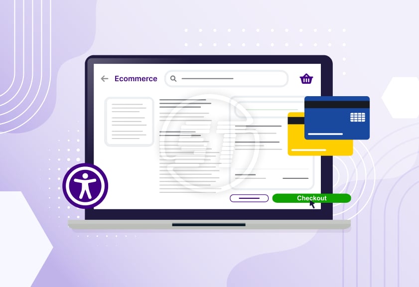
Ecommerce is all about offering an enticing, seamless experience to every visitor to generate business.
To attract users/visitors, brands try to build appealing homepages, lightning-fast product pages, and AI-powered recommendations. However, there is a most crucial aspect – the checkout – that remains one of the least accessible parts of the customer journey. While manual accessibility audits often focus on color contrast, alt text, or navigation, the checkout experience quietly becomes the biggest barrier for people with disabilities.
Every inaccessible field, confusing label, or unannounced error message can turn an eager customer into an abandoned cart statistic.
This article breaks down more information about accessible checkout.
Checkout accessibility matter more than an organization can think!
Most users with disabilities can work around minor issues earlier in the funnel, but checkout is different:
- Checkout is the highest-stress, highest-drop-off zone
- It directly impacts revenue
- It’s often built using third-party plugins
Customers are already juggling payment details, shipping options, OTPs, and the time pressure. Any accessibility friction - keyboard traps, unclear focus states, inaccessible CAPTCHA - magnifies frustration.
If a user reaches checkout to purchase their desired product, an inaccessible field blocks them, and the brand loses not only a sale but also lifetime value. Accessibility issues at checkout affect conversion and profits more than any other part of the site.
Many ecommerce stores use prebuilt checkout systems that are not fully compliant. Since they’re “plug and play”, teams rarely audit them deeply.
Common accessibility issues hidden inside checkout flows
- Missing or incorrect form labels
Screen reader users rely on clear labels to understand what a field expects - “Name” vs. “Full Name (as on card)” makes a big difference. Placeholder-only labels vanish when typing, leaving users confused.
- Poor error handling
Unannounced error messages, vague instructions (“Something went wrong”), or error text that appears outside the focus order make corrections nearly impossible.
- Complex, inaccessible payment gateways
Many payment widgets trap keyboard focus or announce nothing to assistive technologies. Multi-step OTP inputs or interactive card fields often fail WCAG 2.2 standards.
- Timed sessions without warnings
Session timeouts are common for security, but users with cognitive or motor impairments need more time. Without alerts or extension options, they lose their progress.
- Inaccessible CAPTCHA/anti-fraud checks
Visual CAPTCHA is still shockingly common. Without audio or alternative mechanisms, checkout becomes a locked door for many users.
- Confusing shipping and address forms
Dropdowns, autofill failures, in accessible map pickers, and unclear format instructions all contribute to abandonment.
Build an accessible checkout that increase conversions
- Start with a semantic, assistive-tech-friendly form design
- 1. Proper <label> tags linked via for attributes
- 2. Descriptive instructions
- 3. Visible and persistent labels
- 4. Clear logical field grouping with <fieldset> and <legend>
Use:
- Fix error messages using WCAG-aligned patterns
- 1. Provide error summaries at the top.
- 2. Autofocus on the first error
- 3. Announce error via ARIA live regions.
- 4. Use actionable messages (“Enter a 10-digit mobile number”) instead of generic warnings.
An accessible checkout must:
- Ensure frictionless keyboard navigation
Every control - delivery options, radio buttons, quantity selectors, coupon boxes - should be reachable and operable via keyboard. Add visible indicators that meet contrast standards.
- Choose accessible payment gateways
- 1. Screen reader accessibility
- 2. Logical tab order
- 3. Accessible OTP flows
- 4. Proper announcement of secure iframe fields
Brands must audit third-party payment modules just like they do for their own web pages. Test:
If a vendor fails WCAG basics, switch.
- Replace CAPTCHA with modern, accessible alternatives
- 1. Invisible CAPTCHA
- 2. ReCAPTCHA v3
- 3. Device-level risk assessment
- 4. Email/SMS verification
Use:
These reduce user friction while maintaining security.
- Provide time-extension alerts for session expiration
Offer users a warning 60-90 seconds before timeout and a simple button to extend the session.
- Optimize for mobile assistive technologies
- 1. TalkBack
- 2. VoiceOver
- 3. Switch Access
- 4. Zoom/magnification
- 5. Large text mode
Checkout often happens on phones. Test with:
Make sure content doesn’t break or overlap when resized.
Testing checklist: How to audit checkout accessibility properly?
Audit teams should follow an effective checklist to avoid missing important facets:
- Can a user complete checkout using only a keyboard?
- Does every payment field have a properly associated label?
- Can a screen reader user understand every field, button, and option?
- Are errors announced clearly and in real time?
- Does the flow handle large text, zoom, and high contrast modes?
- Are interactive components (date pickers, OTP inputs, dropdowns) fully accessible?
- Can the user choose accessible alternatives to CAPTCHA?
- Does the system provide clear success confirmation with screen reader announcements?
This checklist alone uncovers 50-70% of common failures.
Accessible checkout is a growth strategy - why?
- It reduces cart abandonment at the most critical step
- It creates a trustworthy, stress-free buying experience
- It expands the customer base without extra marketing
- It lowers customer support costs
- It improves brand reputation and customer loyalty
- It strengthens compliance and reduces legal/financial risk
- It improves overall CX metrics, not just accessibility
- 1. Clearer forms
- 2. Better error handling
- 3. Faster navigation
- 4. More intuitive payment flows
- 5. More reliable mobile experience
Cart abandonment is already high in ecommerce, but accessibility barriers - confusing form fields, inaccessible payment widgets, keyboard traps, and unreadable errors - push it even higher. By fixing these issues, brands remove friction right at the point where customers are most ready to buy.
When shoppers encounter a clean, predictable, and assistive-tech-friendly checkout, it signals professionalism and inclusivity. Customers trust brands that feel easy, calm, and error-free - especially when entering sensitive details like card numbers and addresses.
Roughly 1 in 4 adults has a disability, and millions more experience temporary or situational limitations - broken glasses, glare on mobile screens, new parents using one hand, older users struggling with tiny fields.
An accessible checkout welcomes every user.
A large percentage of support queries about “payment failed”, “form not submitting”, “address not accepted”, come from poorly designed checkouts. Accessible designs reduce these issues dramatically by making steps clear, errors descriptive, and flows predictable.
Shoppers remember ease, not aesthetics. A smooth checkout leaves a psychological imprint on users. And when people with disabilities find a site that feels accessible, they often become long-term loyal customers - and vocal advocates.
With ADA, WCAG 2.1, 2.2, and international accessibility standards tightening, checkout is one of the highest-risk areas because it directly impacts equal access to commerce. Accessible checkout reduced exposure to lawsuits, penalties, or forced remediation.
When a brand builds its web designs for accessibility, it focuses on universal UX problems, such as:
Read more: Multilingual Accessibility in Global Holiday Shopping
Wrapping up
While most brands polish homepages and product listings for accessibility, the checkout process often escapes rigorous examination. Yet, this one step determines whether a customer completes their purchase or walks away in frustration. By prioritizing accessible form design, error handling, payment gateway compatibility, and assistive-tech testing, businesses can unblock hidden revenue, improve usability, and build trust with every shopper.
Save 20% OFF with WCAG Accessibility widget coupon code to enhance website's digital inclusive experience!
Use coupon code: at the checkout.
*The code is valid for the first-time purchase / new customers and annual plans. Not applicable on renewal.
Strengthen conversions, customer trust, and compliance by closing the accessibility gap at checkout. We support ecommerce brands with manual accessibility audit, website accessibility remediation, ongoing compliance services, PDF / document accessibility, VPAT report service / ACR that improve usability for every shopper. If you’re aiming to reduce drop-offs and create a seamless buying path for all users, reach out hello@skynettechnologies.com to discuss tailored ecommerce accessibility support.


