So, you brainstormed compelling email content, curated hooking subject lines, and did everything to skyrocket your email marketing campaign. But, unfortunately, results are far away from your reach. What went wrong? It's the design glitches, probably!
Did you know that missing out on responsive email designs can bruise your strategies dramatically? Yes, you read it right. Without a mobile-friendly design, you might slip out on a massive 3.5 billion smartphone users! So, you may have overlooked investing in a mobile-friendly email template if your firm isn't getting enough customer engagement.
Are you wondering how to deliver a mobile-friendly experience to your users? Don't worry anymore. Here are some proven tips to offer highly responsive email designs to your subscribers. But before resorting anywhere, let's learn why responsive designs are necessary to your brand.
Why are Responsive Email Designs Essential in Your Brand?
The advent of smartphones revamped many legacy marketing channels, primarily emails. Yeah, the change accompanies skyscraping lead generation, customer engagement, and higher sales. So, a mobile-friendly email design won't hurt you but unlock tremendous benefits for your business. Get a glimpse of what responsive emails bring to your table, making them highly essential in your campaign.
Grab a Massive User Base
Who doesn’t wish to grab the massive smartphone user base! Believe it or not, you can convert billions of smartphone users into your customers. But how to do so? Responsive email design, simple! A mobile-friendly email design caters to all small screens and encourages the users to engage with your business immediately, leading to optimum conversions.
Get Highly-Available Leads for Your Business
Did you know that an adult spends roughly 3 hours a day on their smartphone? Surprising, right? Well, yeah, smartphone users hover on their devices for the longest time and are more likely to engage with your brand. Catering to them with mobile-friendly emails can shoot your engagements to all-new levels.
Turn the Users’ Product Research Time in Your Favors
69% of internet users research products using their smartphones, says a report. Guess what? You can play your email cards before such a massive chunk to drive higher click-through rates. So, responsive email designs enable utilizing all shoppers conducting product research on their devices for your company.
Users with Higher Shopping Tendencies - All in Your Court!
Let's admit that smartphones have revolutionized shopping experiences for customers. Now, roughly 66% of web surfers use shopping apps for more purchases. What does it imply? Well, these shopaholic mobile users click through your emails more, visit your website, and spend more time browsing your offerings. Undeniably, mobile-friendly emails bring more shoppers to your doorstep.
An alluring email design is an indispensable part of an email marketing strategy. A well-executed design and perfectly developed email drives action and generates revenue. With an intuitive UI/UX design service, we focus on building mobile-friendly, responsive email templates that offer perfect rendering across multiple devices. We also provide you custom-made templates that are unique to your brand and customized as per your needs.
7 Must-Know Tips to Create Responsive Emails
You already know how responsive emails uplift your marketing efforts. Now, it's time to create such high-yielding emails for your business. But alas! You don't know how to begin, right? Stop worrying as we've got your back! Here are the 7 must-know tips to craft responsive emails for your business. Let's get started!
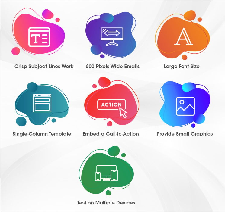
Crisp Subject Lines Work
Have you noticed how constricted mobile inbox layouts are? So, long and elaborated subject lines don’t work on mobile apps, to be honest. Wordsmith your subject phrase and try keeping it as crisp as possible. Such a small title remains visible on all mobile devices while communicating your entire message to the recipients.
600 Pixels Wide Emails are Ideal for All Devices
If you think a responsive email template is everything, rethink! Some devices cannot show responsive emails as expected. Right here, manual adjustments come in!
Head to the email template settings and adjust the correspondence width to 600 pixels or less. When you alter the template width equal to or less than 600 pixels, the emails become well-formatted and legible to all devices irrespective of the size.
Choose a Large Font Size
Mobile devices have small screens - we all know it. If you go with a font size chosen for desktops, it'd be barely visible to smartphone users without zooming. Consequently, some of your valuable leads will bounce back, resulting in higher opening rates but inconspicuous click-through rates.
Dodge everything with significantly large font size in your emails. Choose 13 or 14 pixels font size and watch your emails become more readable for smartphone holders.
Nothing Better than a Single-Column Template
The more the columns, the more the confusion. The rule applies to all mobile devices regardless of the screen size. Most devices cannot show more than one email column at once to the users. So, your leads may not come to know that more columns and information exist in the emails.
Furthermore, multiple columns become complex to navigate, leading to higher customer bounce rates. Omit all these troubles by leveraging just a single column with all information presented in a concise yet legible format for optimum engagements.
Embed a Call-to-Action to Drive More Engagements
The emails having definitive call-to-action registers a whopping 371% of more clicks. The impact becomes more concrete when email CTAs appear before your mobile audience. Get more engagements through them by embedding interactive CTAs in your responsive email design. Try it out once!
Understand User Limitations by Providing Small Graphics in Emails
Let's admit that most of your valuable customers use data packs to operate emails. Don't let your users waste their data bandwidth in loading heavy graphics and skipping important content. Implement smaller images in your emails and allow them to focus more on your content.
Test Rigorously on Multiple Devices
Following any email tips and sending to your leads without testing can be fatal for your brand. So, view your emails on multiple screens every time you make a change and check their accessibility before sending them to your mailing list. Such a healthy habit will keep common glitches at bay!
Woohoo! You've mastered creating responsive email designs. More precisely, you now know how to get higher engagements using mobile-friendly emails. So, what makes you wait? Jump into creating compelling emails for your smartphone-using audience and skyrocket your sales now!
We know that a strong email campaign strategy is the peak for any brand. At Skynet Technologies, we offer complete Email Marketing Services, from custom email template design to email program management. We'll collaborate with you to better understand your target audience, strategize, and develop strategic campaigns that aim to deliver excellent customer experiences. We provide frictionless user experience email design to catch the user's attention.