WCAG standards are universally accepted and applied on a profound number of websites. However, many websites are still struggling to achieve basic conformance level. Whereas there are some websites that have set the bar for others to achieve accessibility.
The websites that are committed to building an inclusive web world for everyone, took WCAG and ADA compliance seriously and applied the standards to their website UI and UX.
“Accessible design is a good design – it benefits people who don’t have disabilities as well as people who do. Accessibility is all about removing barriers and providing the benefits of technology to everyone.” - Steve Ballmer
Some organizations are helping users with or without disabilities by providing them with accessible websites and equal opportunities to consume information. Let’s see which are these websites and what they have implemented.
YOU MAY ALSO LIKE: Screen Reader Accessibility
Web Accessibility Examples
There are some defined guidelines to build an accessible website and each organization needs to follow them. The accessibility guidelines are meant to make people’s lives easier, especially people with any kind of disability. Visual impairment, hearing loss, motor or cognitive issues, and all other types of disabilities need to be considered in website design.
Accessibility also focuses on the website’s HTML coding so that it can be accessed via screen readers and all other assistive technologies. In short, every aspect of the website should be accessible by everyone, then only it can be declared as an ADA-compliant website.
1. Keyboard navigation
Users with motor problems cannot use the mouse to navigate through web pages. It is completely impossible for them to make a grip for a longer time on the desktop mouse. WCAG says, each element on the web page should be operable using keyboards; be it a computer/laptop keyboard or keyboard emulator.
The best example of this feature is the BBC News website. They have implemented this functionality in a way that users can access the website and navigate through it by only pressing the Tab button on the keyboard.
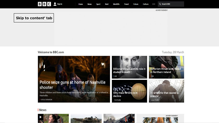
You can see here ‘Skip to content’ tab, which is selected through Tab button and similarly users can jump to other sections using Tab.
2. Color contrast
People suffering from visibility issues are not able to access many websites due to the color options websites have chosen. Despite, you have chosen minimalist colors and designs, several users can find it difficult to explore your web pages because of background or text colours.
Therefore, WCAG has given a certain ratio for website color and background so that everybody can easily read or view the website content. According to this standard, text, and background must have a contrast ratio of 4.5:1 for a clearer view.
Have you ever visited Scope’s website? It is one of the finest examples of maintaining color contrast. They have kept high contrast ratio of 9.66:1 between its logo and page background.
You can also take a tour to Skynet Technologies USA LLC website and see how smartly we kept settings for color blind and visually impaired users.
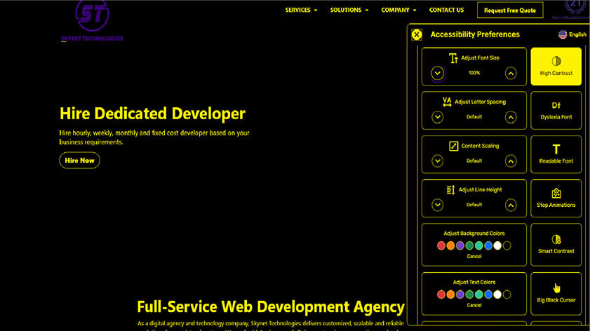
Here Skynet Technologies website is showing high contrast for users who have issues to read text in light background.
3. Correction message
WCAG also suggests that websites must help users to find the information they are looking for. If the user types wrong spelling in the search box, there should be real-time corrections get applied to the wrong text so that they will find their desired information or products/services quickly.
Metropolitan Transportation Authority of New York has imparted such a responsive search option on their website that uplifts user experience for searching anything easily.
4. Navigation through breadcrumbs
Often users get lost somewhere on the website while exploring the information and then most likely they close the window due to confusion. Thereby, to help users find their exact location on a website, WCAG recommended providing a breadcrumb in web design. It keeps showing users where they are heading and how long they must keep going to find their desired information. Also, it shows where exactly a web page sits in the bunch of many web pages.
You must have seen Vasa Museum (Sweden) website; it has used breadcrumbs so very well that each page makes the user journey comprehensive with the series of links at the top of the page. And it also shows how a page fits into the whole navigation.
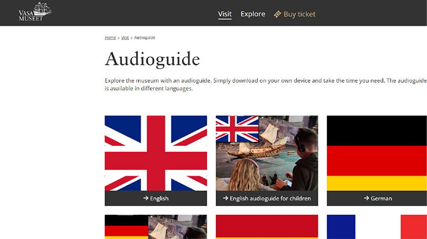
Breadcrumbs navigation is visible on the top of the page of museum’s website.
5. Text resizing
Text size matters to everyone. If a website has smaller than usual text, it can be problematic for users with low vision. Therefore, according to WCAG resizing of texts must be there and it should not cause damage to the page layout. Moreover, images should not be used to display text, they can create distractions. Text resizing is expected to go up to 200 percent of its original size that too without losing content and functionality.
Skynet Technologies USA LLC website is one of the finest examples of text resizing. It allows users to resize the text without losing its content. Users can scale the text and content by more than 500% and peruse it properly.
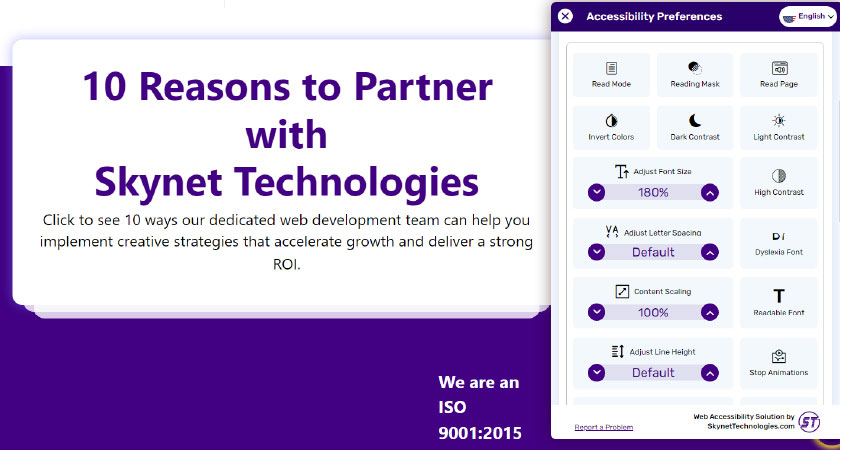
On this page text has been resized at 180%.
6. Pause, stop, and hide option
A website with maximum information and minimal distracting elements is being assumed as the best web design. Because people can explore it without having to concentrate on each element. However, sometimes, designers put too many dynamic elements that appear on the screen from nowhere, or stopping some elements is not possible.
Thus, to eliminate this problem from websites, WCAG has suggested giving a pause, stop or hide button for users who find such elements troublesome.
BMW’s homepage has adopted this standard completely and put pause and play button on its homepage to make it easy for many users. Other than BMW’s website, Skynet Technologies USA LLC has included accessibility thoroughly in their website. For users with cognitive and learning issues, they have hide images, stop animation, and other relevant options. So that everyone can easily explore their website and get desired information.
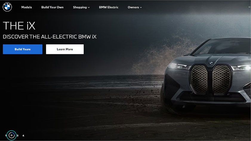
Pause button is visible on the left most corner of the website.
YOU MAY ALSO LIKE: How to avoid ADA lawsuit?
7. Alt text requirement
There are users who use assistive technology to consume the website’s content. Assistive technologies cannot understand images, but they can describe alt texts associated with the specific image and make website content understandable for users. Thus, WCAG has made it compulsory to add alt text with each image a website contains. So that every user can perceive it correctly.
The National Federation of Blind (USA) follows the best practices to make images consumable for assistive technologies as well.
8. HTML tags for headings
Headings are crucial for web page content. It is a simple way of making a design accessible. Headers break the whole content into smaller and more understandable pieces. But for some reason, often designers do not give attention to headers.
WCAG says, do not skip headings and give them a proper structure because users who depend on assistive technology cannot understand the content in the absence of correct headings.
The website of the Federal Aviation Administration is a good example of the right usage of headings. All essential information is accessible to everyone on their website.
9. Table of content
Some web pages have a lot of information on a single page and that becomes cumbersome for users to go through the whole page. To make such pages easier to read, WCAG asks to break the complexity of the page using the table of contents. It has links to every heading available on the page to provide an overview of the content. Thus, users can directly jump to the point they are looking for.
For example, look at Wikipedia’s pages; they have table of contents which make them easier to peruse.
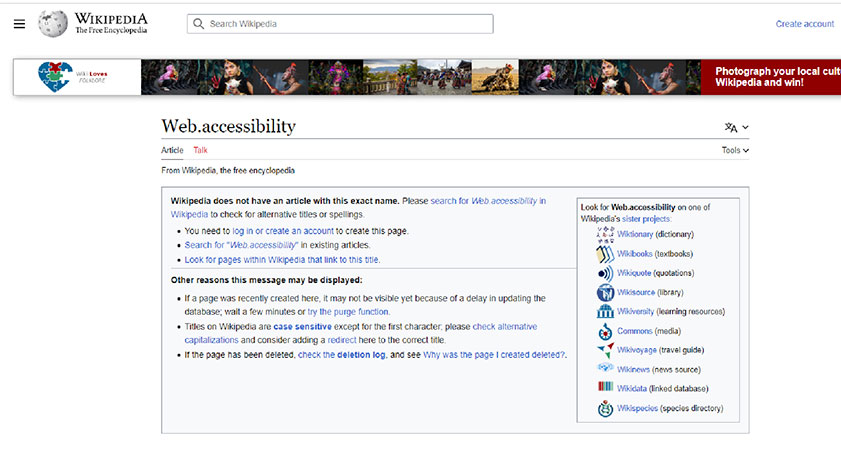
On this web page of Wikipedia, table of contents can be seen in left side.
10. Links
All the links on the web page should be highlighted so that users relying on assistive technology, can click on the links that are useful to them and navigate through the website's other pages.
Skynet Technologies USA LLC applied this best practice in their web design and kept all the links highlighted and clearly mentioned.
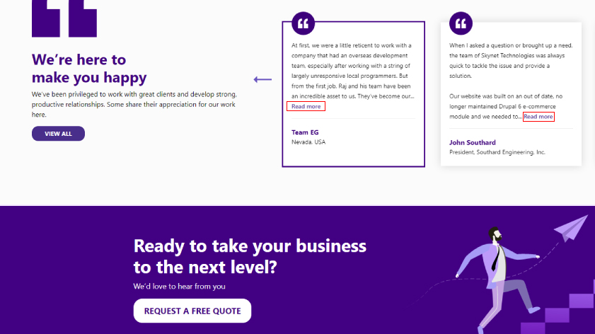
There are links on the page like ‘read more’, which is clearly visible.
11. Page Titles
An appropriate page title helps your website have a smoother navigation since when a user begins to peruse your webpage, the screen reader reads the page title first and then goes to the next part of the page. Thus, if the title reflects the content you have curated within, users will know what they are going to consume.
Have you seen W3C website? They have kept all the page titles precise, compelling, and descriptive. Visit them once to understand what a web page title should look like.
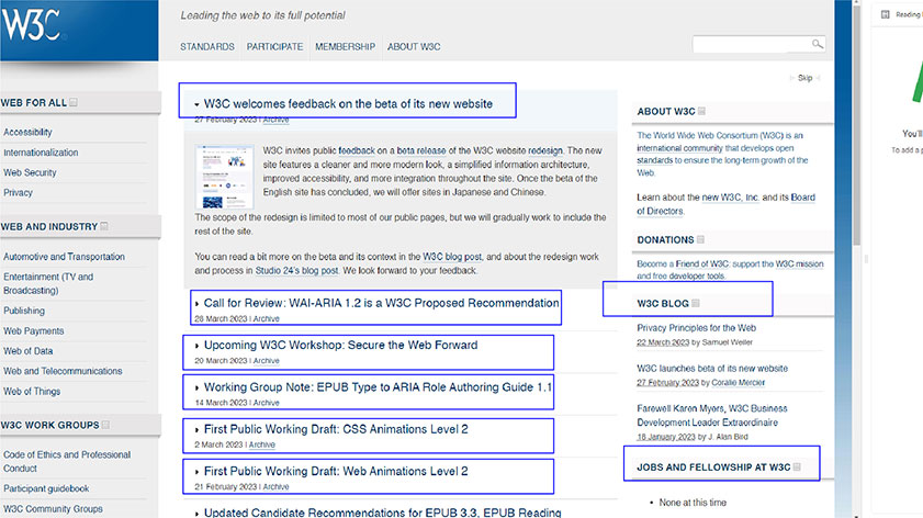
You can see clearly mentioned page title here, which is self-explanatory.
YOU MAY ALSO LIKE: W3C Accessibility Guidelines
Wrapping up
Accessibility implies more people using a website without having to face any trouble. Be it any sort of disability, a website must acknowledge that and provide an alternate for the same.
The above-mentioned examples show that there are organizations following the standards and best practices defined by WCAG. The laws are forcing every organization to focus on WCAG standards and include them in their web design.
Hopefully, maximum organizations start adhering to accessibility guidelines and build an inclusive and accessible web world for everyone!
Skynet Technologies offers a complete range of ADA website accessibility services to ensure your website meets accessibility regulations. Our ADA web accessibility services include ADA website audit, strategy, design, development, remediation, and support for ADA, WCAG 2.0, 2.1, and Section 508 compliance, all tailored to fit within your budget. Get in touch with us today to request a free quote by filling out the form below or emailing us at hello@skynettechnologies.com.
